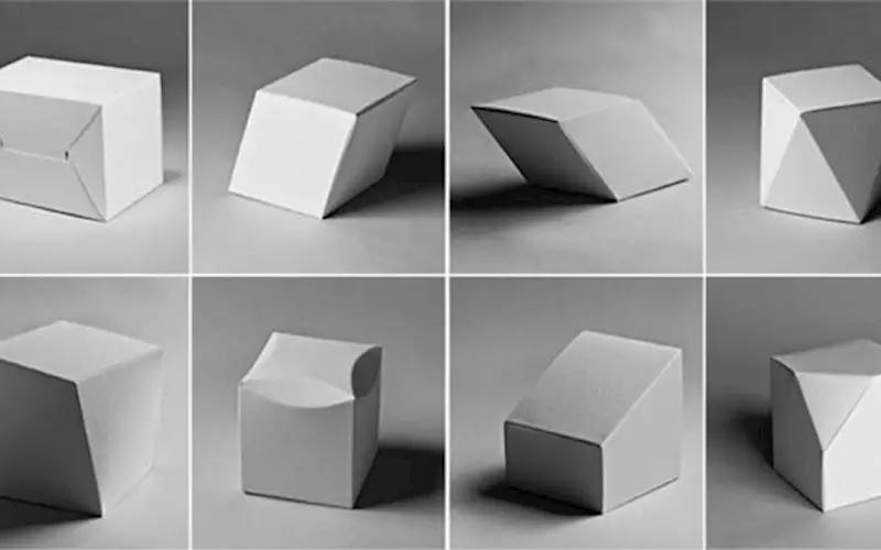
Packaging design is all about structure, durability, ergonomics, appeal and aesthetics. Bhavika Shah shares eight tips to keep in mind before you start on with your packaging design
Packaging is the first tactile advertisement for your product – the first actual impression your product makes on the consumer. “Do not judge a book by its cover”, is often what we are told, but do we?
Packaging design is more than an artwork or graphic applied to the product. It includes many aspects like structure, durability, ergonomics, appeal and aesthetics.
Today 74% of purchases in a supermarket are impulse buys based on the look of the product or what sense it stimulates. Consumers tend to go into a supermarket with a list of four-five products and leave with more than ten. Packaging! Packaging! Packaging! I cannot stress the impact of effective and relevant packaging on consumer behaviour. The same water packaged in different bottles has a different impact on sales – how does one explain this? It’s a similar case of all other products. Packaging not only influences buying patterns but also makes a consumer feel good – the better the packaging, the more post-purchase pride.
Packaging packs in a story that influences the decision. Based on it, the consumer relates to a product and emotions are evoked.
Following are a few tips that can help you unearth the huge benefits of effective packaging and help keep your designs on track.

Shah: “Offer consumers a keepsake for your brand. Make the container a re-usable or recyclable one”
Know your audience
Arguably the most basic as well as the most important step to effective design is a thorough knowledge of your target audience. Designing for a woman would be very different from designing for a man. Designing for kids differs vastly from designing for adults. College kids would have different expectations to senior citizens. The more focused your demographic, the easier it is to decide on a design direction and make design decisions. Doing your homework and determining a target audience will help streamline your creative process in a big way and make your communication more impactful. The design has to evoke emotion and hence needs to have strong, definite thoughts behind the decisions made.
Clarity in communication
Try this exercise: browse products in a supermarket and ask yourself these two vital questions; What is the product? And what is the brand? Try answering both questions in under four seconds, which is the average time a consumer spends browsing a particular product on the shelf. You will be surprised to see that it is very hard to do this in most cases. A lot of packaging design, especially in the case of food products, is convoluted and unclear messages and untidy design. In order to make the design ‘pop’ on shelves, many designers compromise on the clarity of the most basic message – what is the core product in the first place?
Design, don’t decorate
Less is more! Design solves problems and values functionality along with aesthetics. Packaging design, when not made functional, practical and user-friendly, falls flat. When design focuses only on aesthetics or ‘looks’, it fails to take user-experience into consideration. This can be in the form of a frustrating unboxing experience, unclear information that inhibits purchases or defective packaging that could damage the product. All-in-all, if functionality and practicality are not taken into consideration while designing, it can reflect on the general consumer perception of your product. Poor packaging might mean a poor product in many consumers’ eyes, even if your product is of superior quality.
Keep it simple – as simple as you can
Trying to oversell your product through ostentatious packaging design, more often than not, has the opposite effect. Packaging littered with product benefits and empty promises runs the risk of confusing your customer and camouflaging your brand and brand message. Too many colours, too much content and too many typefaces always hurt everybody and there is no need for it. That being said, a completely minimal look with hardly any information is just as risky. The trick is to find the perfect balance which showcases the brand and clearly conveys all the key information needed.
Online or on the shelf?
Many new brands want to display their products in brick and mortar stores but also online to increase sales. Designing for these two environments is largely different and different things must be taken into consideration. When displaying in brick and mortar stores, your product will have to compete with the other products there. Its packaging must be practical, stackable but at the same time, must stand out. However, when dealing with online, the tactile sensation of holding the box and tangibly experiencing the packaging is non-existent. Hence, the packaging must make up for it by appealing to the other senses. Presentation, colour and typography become the most important for products displayed online.
Keep your competition close
Keep your friends close and your competition closer. Be in touch with what others are doing in your field. Stay ahead of the game by doing your own research, keeping up with international trends as well as what is happening locally. Find out which section your product will be displayed in a store. Observe the packaging trends of this section and try breaking out of the mould to make your product look unique and stand out.
Engage with interactions
Make your packaging design interactive. Offer consumers a little keepsake for your brand to stay in their minds. Make the container a re-usable or recyclable one. There are countless ways to make your designs interactive to engage with customers in a way that they will never forget.
Explore print techniques
Make beautiful print techniques a part of the design. This will denote that your product is quality-oriented, attentive to details and design-forward. There is nothing worse than poor print techniques implemented on a beautiful design. The print techniques you choose have the power to make or break your design and the vendor should be chosen carefully and wisely. The quality of the printing will reflect the quality of your product.
Your consumers are your people, one of you – we need to talk to them through the packaging. It has to be communicative. Through the packaging, we can create a story, give the brand a personality and make it memorable. The truth is that visuals speak more than 1000 words. Consumers do not read what is on the packaging; they want to glimpse and understand. Because of this, we need to create packaging that tells a story in the four seconds that the buyer looks at it for; a compelling story that has a pickup value.
Bhavika Shah is the founder of Mumbai-based design house Beyondesign. After completing her Masters from Georgia, she conceptualised Beyondesign in 2006 and quickly moved on to establish her dynamic all-girls team.


 See All