Private View: Zevic Premium (Stevia Chocolate)
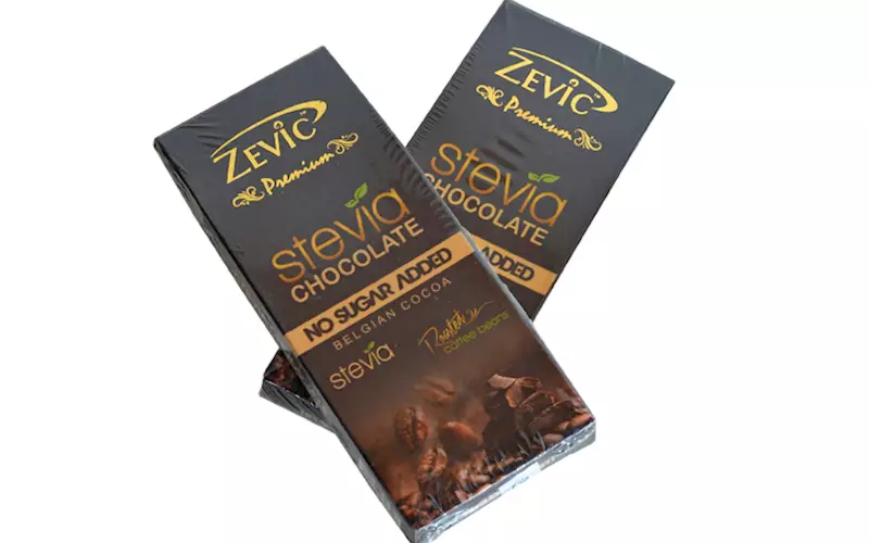
A shrink wrapped mono carton with an extended flap
05 Feb 2020 | By WhatPackaging? Team
Raju Kalgutkar, chief manager-packaging development, consumer products division, Piramal Enterprises
 The pack stands out on the shelf due to its background colour and exclusive design.
The pack has been printed with matt varnish, and a spot UV is used to highlight the key features of the product – ‘No Sugar Added’ and ‘Roasted coffee beans’. Gold foil stamping is used to highlight the brand name.
A shrink wrap has been used for additional pack protection. But, the shrink wrap is uneven, and affects the carton design and printing. The carton is pyramid shaped at the top with a top tuck-in flap.
The pack also comprises of an extended flap locking feature and a tuck-in bottom. But, there is a scope of improvement, the locking of the top tuck-in flap can be made swifter.
Deepa Naik, head-packaging development, Hershey India

The chocolate bar is delicately wrapped with golden foil.
I feel that the mono carton could have been designed or packed with glued end flap, as it would have avoided the use of two tamper-proof stickers.
Also, the use of shrink film on the mono carton made the package look over engineered .
The branding and graphics convey accurate information about the exclusive features of the product, which is interesting as these features have been given a higher visibility as compared to the brand name.


 See All