Shelf differentiation through strategic packaging design
When Marico decided to launch True Roots, Mumbai-based DY Works was tasked with designing a pack that positions it as a scientific creation and establishes the product promise
24 Oct 2018 | By PrintWeek India
From ‘kaale, lambe, ghane baal’ to experimenting with neon, hair colour has been a strong marker of self-expression. So have the discourses around it varied from graceful acceptance of one’s age (accepting greying hair) to greys being seen as tardy (of having given up on grooming).
Amidst this, altered lifestyle factors like stress and pollution cause pre-mature greying. Marico introduced a revolutionary product, True Roots, which delays pre-mature greying working from the roots; a marked departure from the category of dyes that only cover greys. It is not a dye - but one that acts from the roots.
The packaging had to work hard to establish the new category, the new product promise, its natural and non-chemical antecedents and its believability as a hardworking and scientific product. The challenge for DY Works was to bring alive the brand proposition.
Insight
We identified the markers of changing narratives around personal care in India. While the dominant narrative is that chemicals are harmful but convenient and necessary, a fast emerging discourse is playing on the fear of chemicals, with a resurgence of natural products in credible formats – the rise of commercial Ayurveda and botanical ingredients.
A semiotic understanding illustrated how pre-mature greying is no more an aberration, but is an irritant – “had my first grey in the 9th standard”, “most of my friends are greying” – willingness to take hold of it.
The fighting mechanism against the first appearance of pre-mature greys is pulling one out and moving on. This is a stage before submitting to hair colour/dyes – and there is a willingness to adopt a solution provided it is effective, proven and doesn’t test their patience – the need of an “expert” brand!
Tapping into the fear of excessive chemicals – the product found a space as a botanical brand –natural ingredients in a hardworking format – evading the perceived ‘slowness’ of Ayurveda and ‘chemicals’ of hi-science.
The functional benefit of being effective from the roots led to the brand being named True Roots – a simple proposition led nomenclature and easy to comprehend.
Strategy
The packaging had to live up to the brand promise – hardworking with natural and non-chemical qualifications, and also establish a new category.
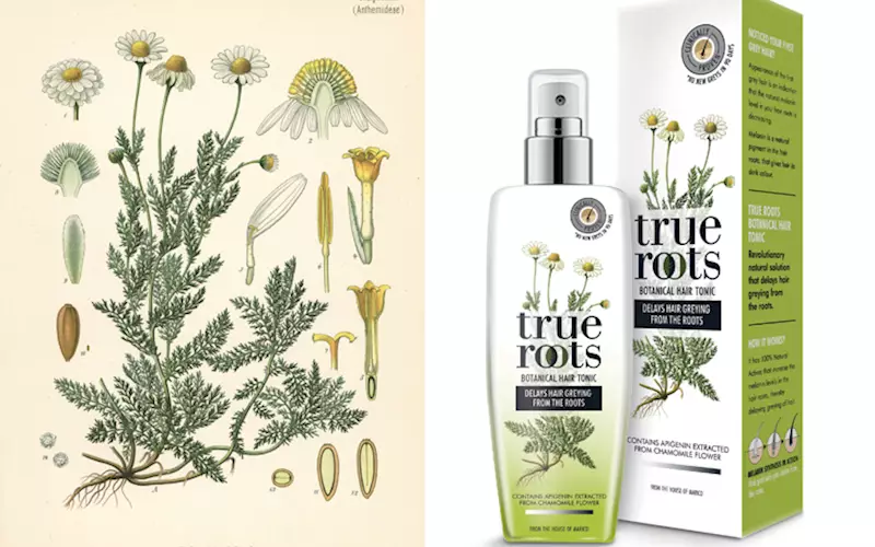
Botanical illustration of the ingredient – Chamomile plant with its raw roots hit the spot, treated appropriately on the background of white to leafy green gradient resonates with natural freshness of the product ingredients.
The identity – True Roots was crafted in black to ring in the functional benefit. Besides, the colour is deployed in a minimal yet keen way – a gradient of white to black strip connoting the de-acceleration of greying.
The messaging hierarchy along with a lab tested mnemonic claiming ‘no new grey in 90 days’ adds robust credibility on the product.
Creating an impactful design goes beyond graphics. Structurally, a spray bottle is used instead of a flap open bottle – perceptually adding to the ‘expert’ credentials. While the chrome plated nozzle top of the spray furthers the scientific working of the product, the pearlised substrate adds to the premium quotient of the brand.

The design is a departure from the current range of hair care products offered by Marico – asserting a new category and commanding a premium


 See All